AYHL 26-27
Season Concept
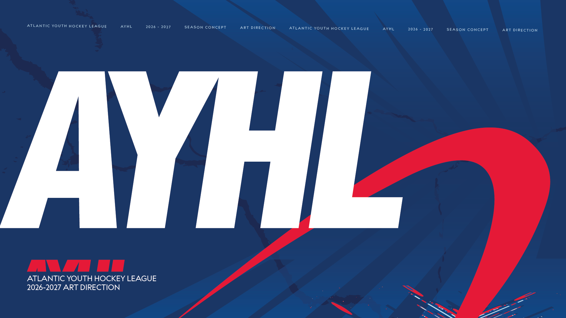
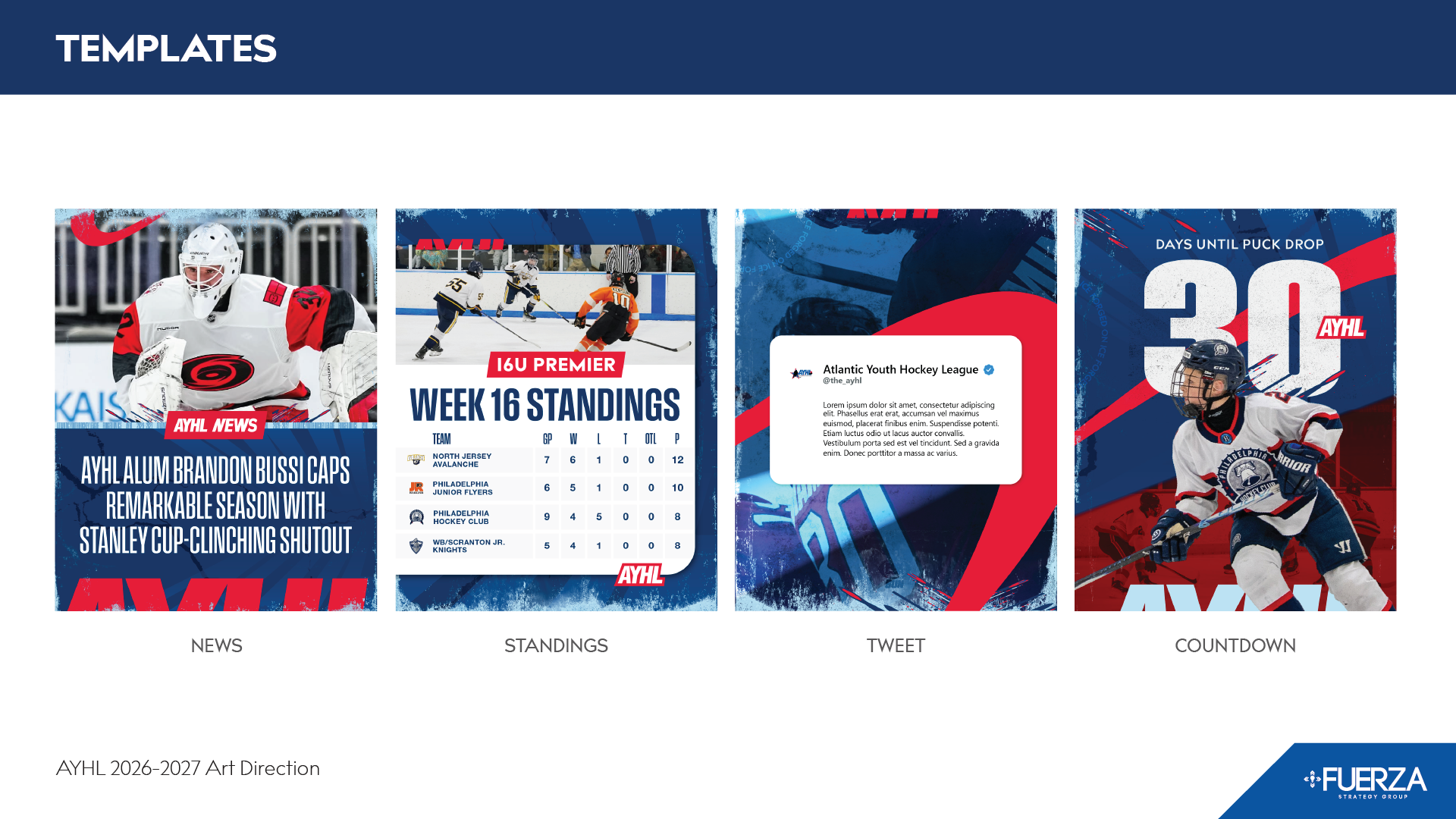
In this case study for the Atlantic Youth Hockey League, I will showcase the work I did to transform the graphics of a youth hockey league into graphics that are comparable to professional sports leagues. I will show where this league was at before I started and walk through the choices that I made for this project.
The Challenges
The AYHL is a youth hockey league. The kids in the AYHL are competitive and many of them go on to play in college, semi pro hockey leagues, and a select few may reach the NHL.
The goal for this season concept was to elevate the graphics that we were making to the same quality that the pros have.
The teams in the AYHL play in mostly empty, poorly lit arenas where it is very hard to get the quality of photos that the professionals have. The AYHL does not have the budget to have consistent game by game or team by team photography. The AYHL has a very small library of graphic elements to draw from.
Graphics for this league have not performed well when compared to photo dumps. A photo with no processing will often perform better than any of our graphic templates. We know, that this league’s followers want to see pictures of their kids, but I think people in general are distrustful of graphics. They don’t want to be sold to.
So, in short, there is a very real limit on what is possible. There are graphic styles used in the NHL that the AYHL cannot emulate.
The Solution
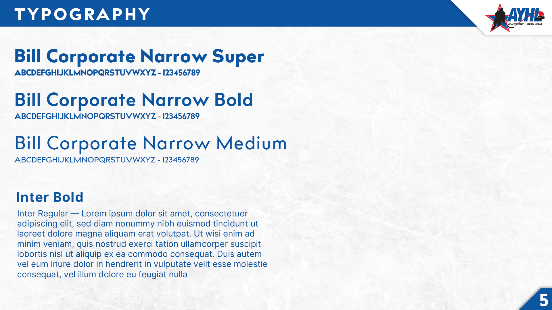
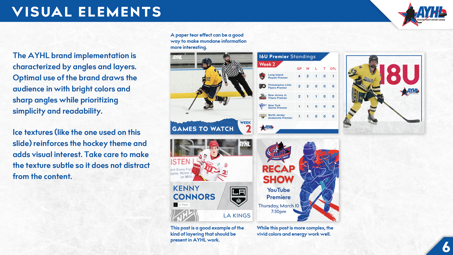
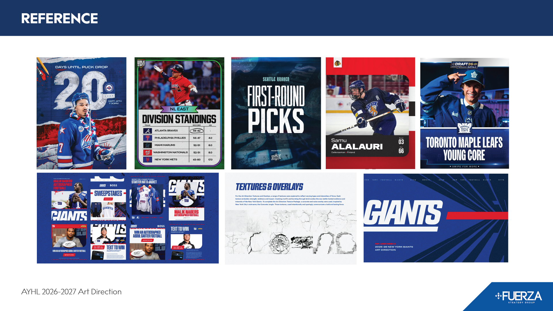
On the images shared above, the first row of graphics is from the AYHL brand guide. I had no part in designing that brand guide, and it pre-dates my work at this agency. I am sharing these graphics to show where this league was just a few years ago. As of last season we only used the standings template from that guide, but this league was not in a place to compete with professional leagues.
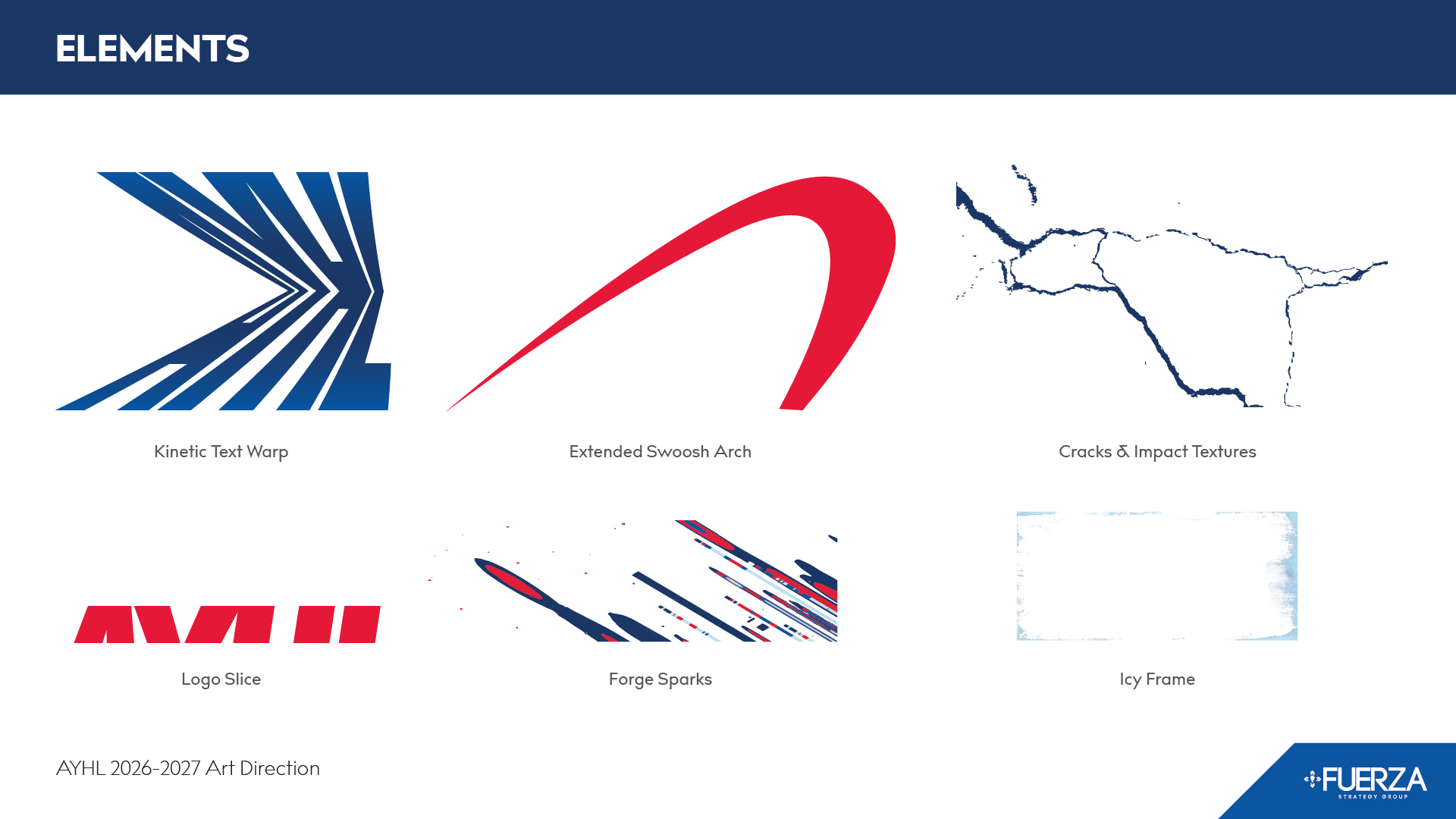
So, I did deep research into the graphics that were used in professional sports leagues, from hockey to football and soccer, to lacrosse and women’s tennis. I looked at everything I could find, to find good fits for what was possible. My intuition was that I could find good graphics in soccer and basketball since they share a similar field/court/rink shape. Instead, I found a recent season concept that the New York Football Giants put out which ended up being the largest area of inspiration for the AYHL’s season concept, with their unique typography treatments featuring super bold, distorted type, logo slices, and fine print text as a supporting design element rather than something that must convey information.
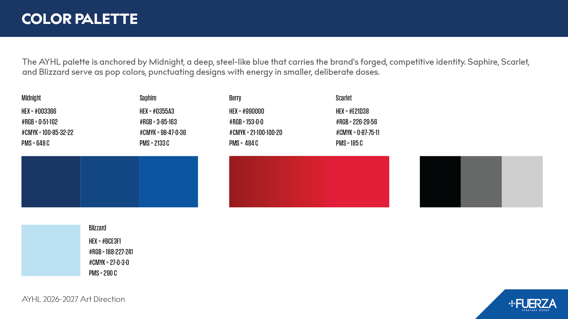
I didn’t make a huge change in the colors. I felt like we have been using the brand blue almost exclusively over the years and I wanted to shift that blue to more of an accent role for this season concept.
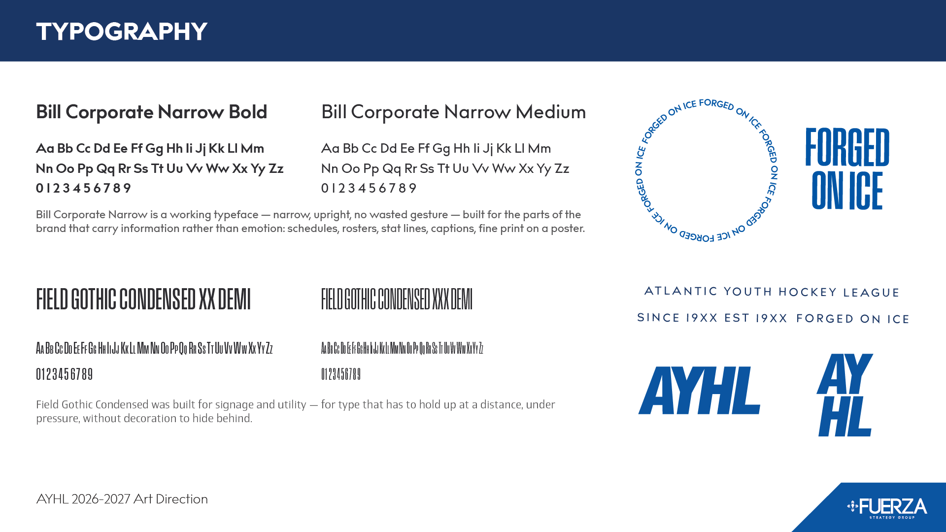
There were some things that this league needed that were obvious changes. It needed a bold super condensed font. All of the sports leagues are using these bold super condensed fonts on their social media. I researched and searched for this niche of typefaces and found about 15 that were initial candidates. I whittled them down by looking at their letter forms to see which ones felt more sporty. I was really particular about the ‘S’ and ‘C’. I wanted the mid-section to be diagonal of the ‘S’ and I wanted the ends of the ‘C’ to be parallel. I wanted sharp angles and ultimately, I narrowed it down to Field Gothic Condensed. The typeface had the things that I felt like it needed to communicate to the fans of this league.
The Outcome