Hallmark x Walmart 23 Easter Concept
In this case study, I describe the challenges of working for the Hallmark x Walmart Visual Merchandising team, the work that I presented to the broader leadership, and the outcomes of that presentation.
The Challenges
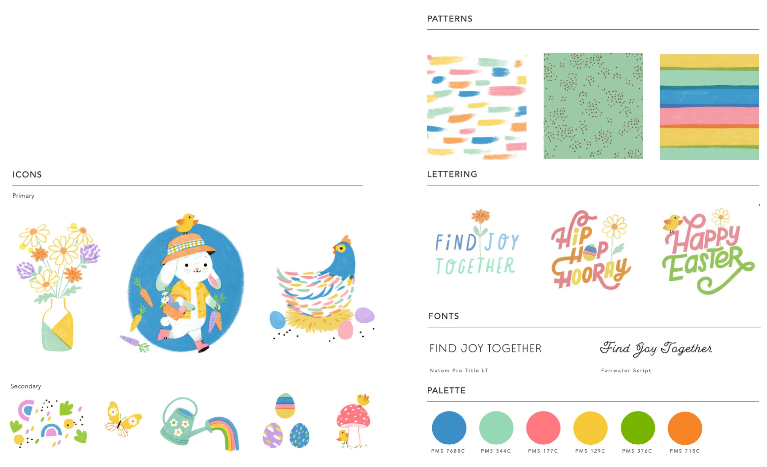
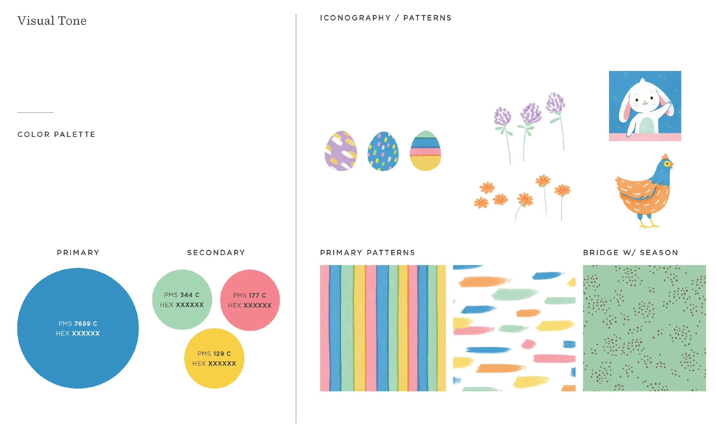
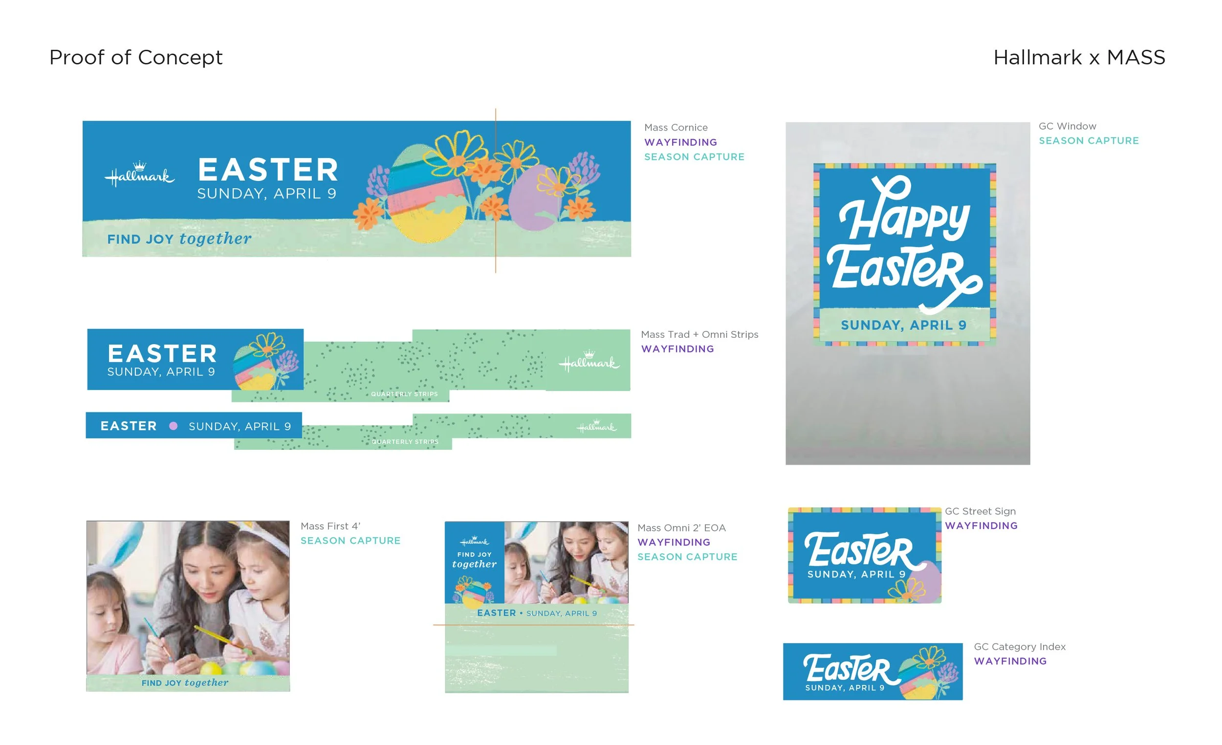
Hallmark works over a year in advance for their visual merchandising sign displays. An art director designs a season concept with messaging, typography, patterns, colors, and a proof of concept that ties everything together.
There are or were (when I was there) two visual merchandising design teams. The MASS team designs the visual merchandising for almost every store that sells Hallmark cards. The Walmart team designs the visual merchandising for essentially Walmart and only Walmart. There are some exceptions, sometimes team members will be moved around for certain projects, but by and large that is how things work. There is a Walmart only team because Walmart wants their visual merchandising to be different from everyone else and as Hallmark’s largest client, they get what they want.
The MASS team gets first pick of the art assets, the colors, the type treatments. The Walmart team uses whatever is left in the art direction.
Walmart wants to highlight product in at least one of the headers.
Hallmark wants their visual merchandising to look different year to year.
My role was to design and present options for Hallmark’s Easter Visual Merchandising to the broader leadership. I was on a contract at the time, and I would not be seeing this project to completion before my contract ended.
The Solutions
I’ll start with saying that I made this work 4 years ago, this is by far the oldest work in my current portfolio. I would do some things differently today.
The reality is that I was handed a difficult situation. Most of the useable art direction was used in MASS, leaving little for Walmart.
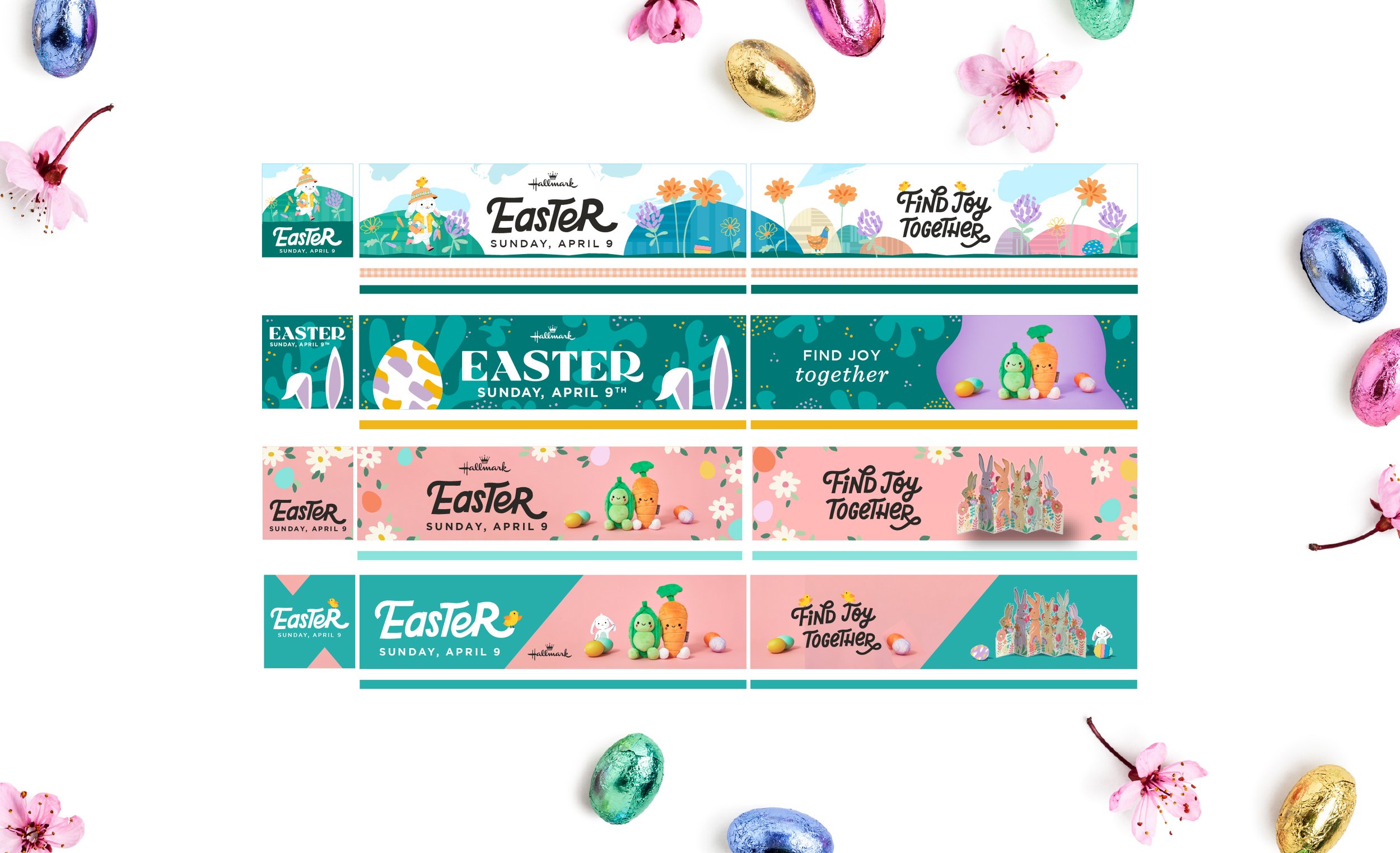
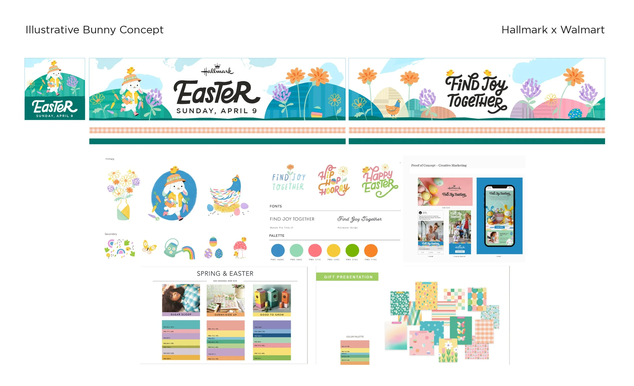
Hallmark has a problem that young people are not gravitating towards the brand like older generations have. Hallmark also is one of the largest fine arts employers in the country. I considered myself young when I worked there, and my solution to these issues was to always try to push the work that the artists were doing to forefront. This is most evident in my Illustrative Bunny concept. At the time I really enjoyed illustrating landscapes and I wanted to design an Easter farmland combining the different Easter illustrations into a world for the Bunny to live in. I think it’s important to design what you are most passionate about. Sometimes you change minds, and sometimes you don’t, but I feel good that at least I tried.
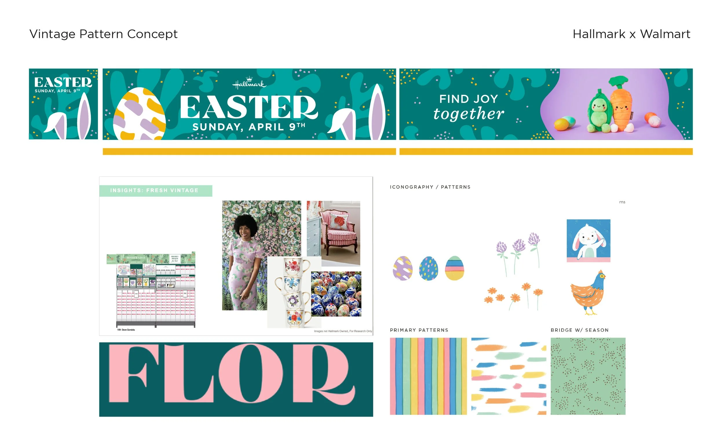
My second concept was the vintage pattern concept, I wanted to lean into some of the inspiration for the art direction rather than the art direction. I sourced and created my own assets for this concept from the patterns to the Easter typography. Typically, this role is more of an assembler than a creator. The artists create assets, the art director organizes them, and then the graphic designer applies them. So, what I was doing was out of scope, but all of this is done in close collaboration with managers. I was allowed to explore this direction, and I was told that they likely were not going to be picked.
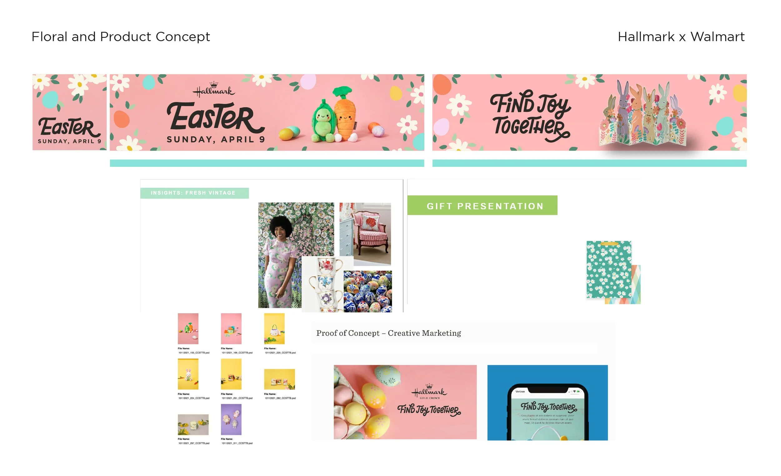
I knew the Floral and Product concept was likely the direction that would be picked. It was a very small part of the initial art direction, but there were proof-of-concept graphics that were created for Hallmark’s gold crown stores and their social channels that showcased the product on pink backgrounds with plenty of empty space that could be filled with their type treatments. Often Hallmark would showcase product with photo frame-like treatment, but this felt like an opportunity for their type treatments and product placement to sit on equal ground. Putting two different products on the headers would be loved by Walmart.
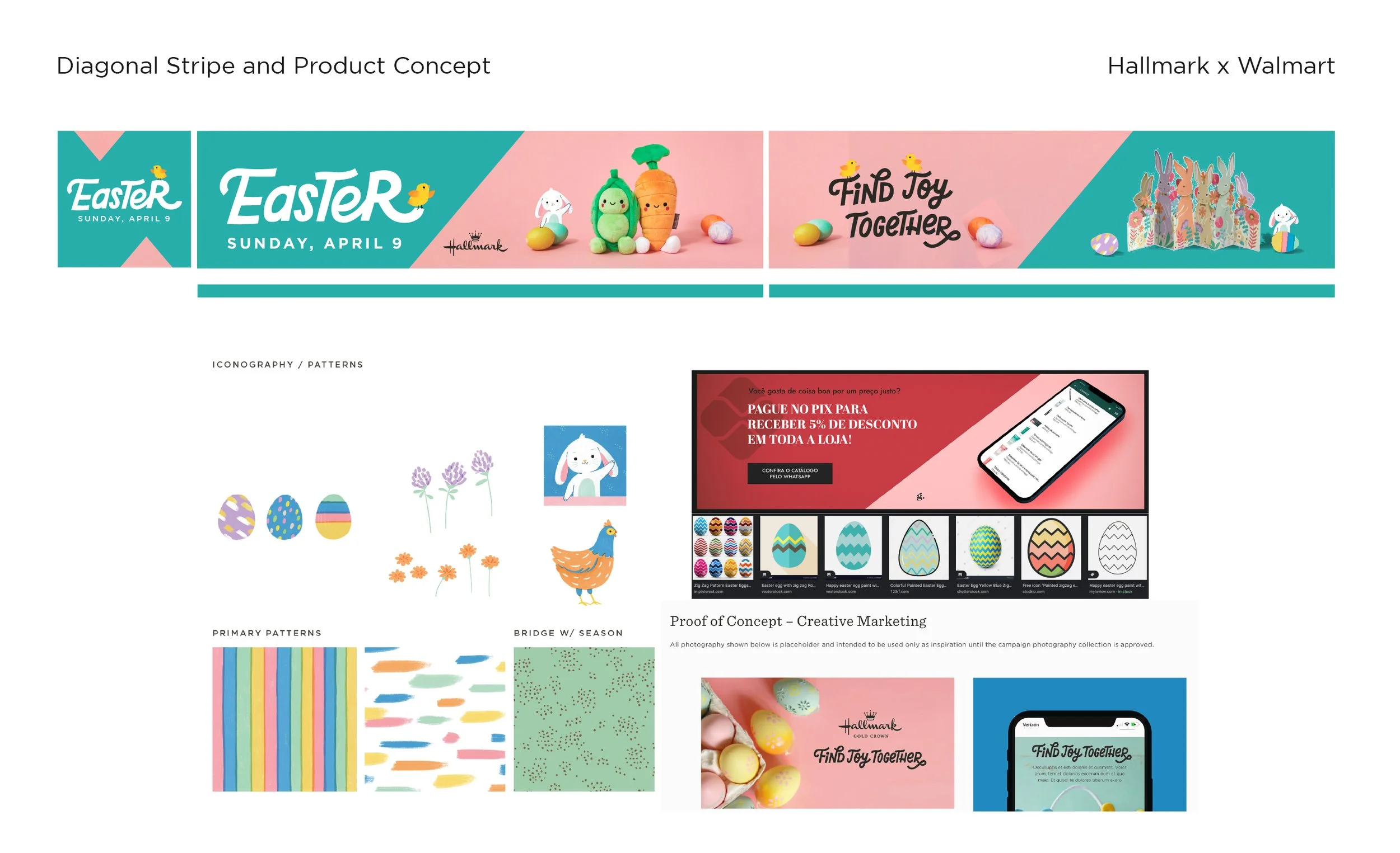
The Diagonal Stripe concept was meant to emulate painted Easter eggs. I felt like I needed another safer concept to present to the broader leadership. This concept also was capable of highlighting product twice and I was able to sneak in the illustrated characters into the background.
The Outcome